
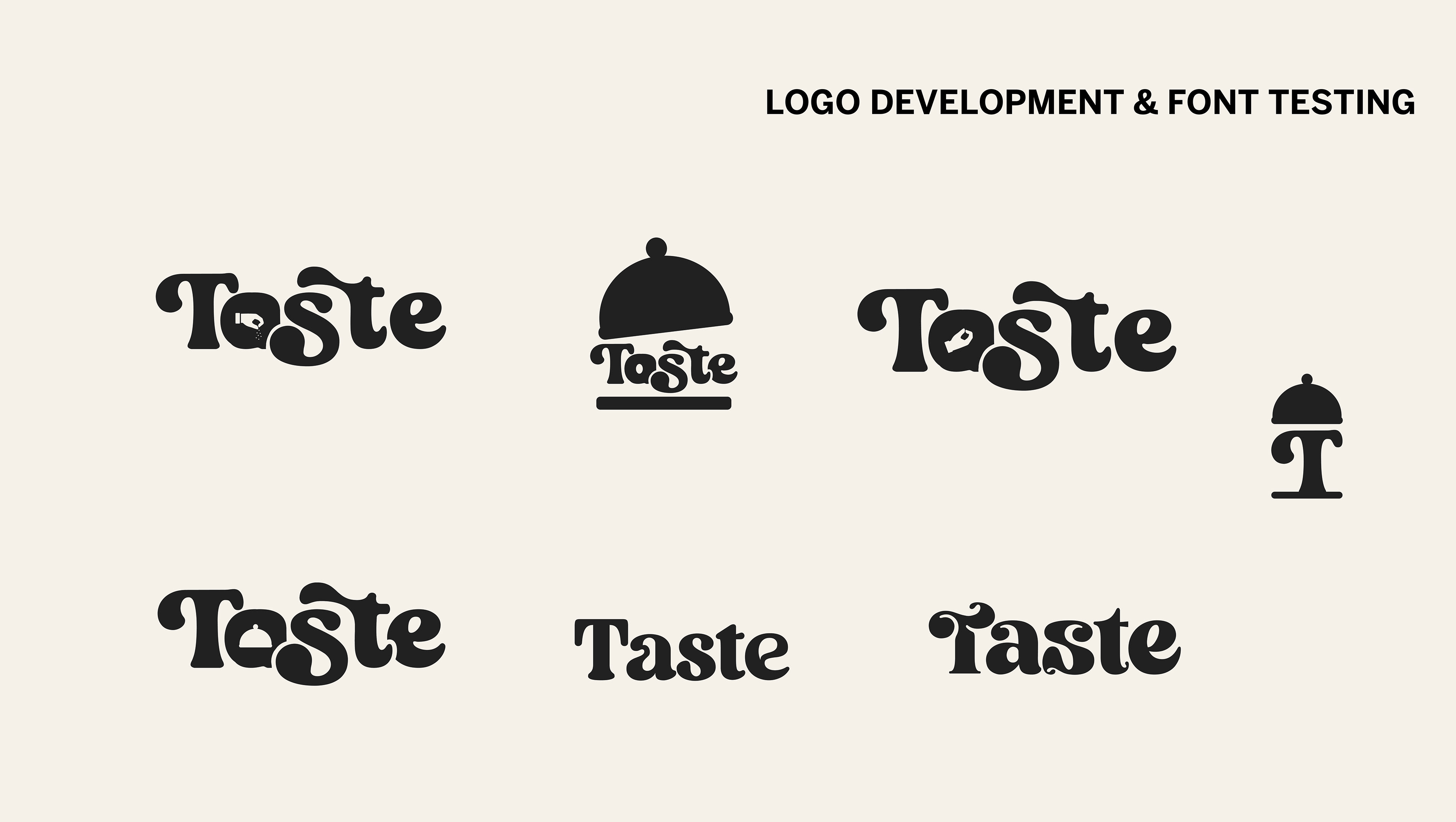
Initial Exploration & Brainstorming
Kenia takes pride in creating this brand from the business name, to the concept, the app design (posting soon), the design graphics, the research process, and how she came up with the idea of what the app is for.
She explored various elements, stories, and looks suitable for Taste's new identity.
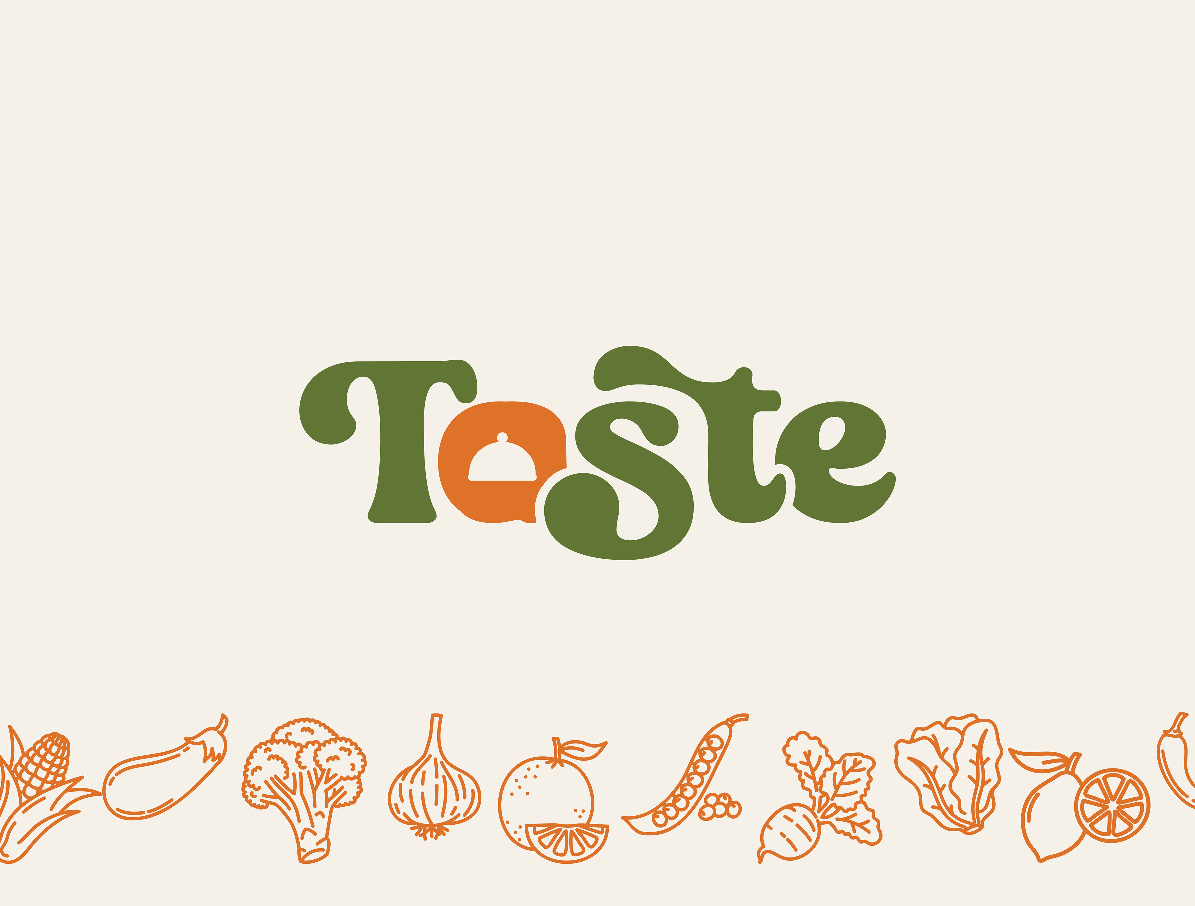
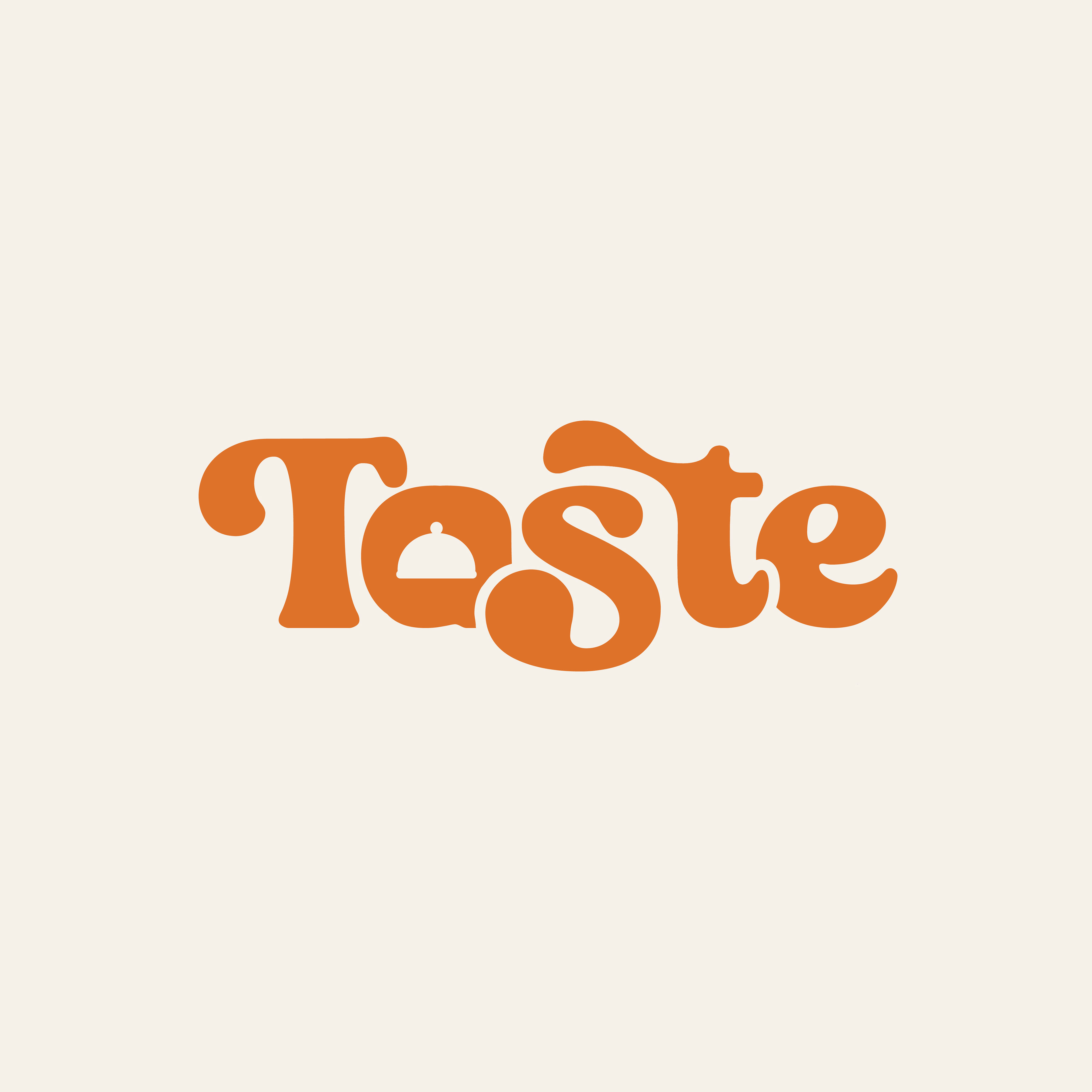
Inspiration & Meaning Behind The Logo
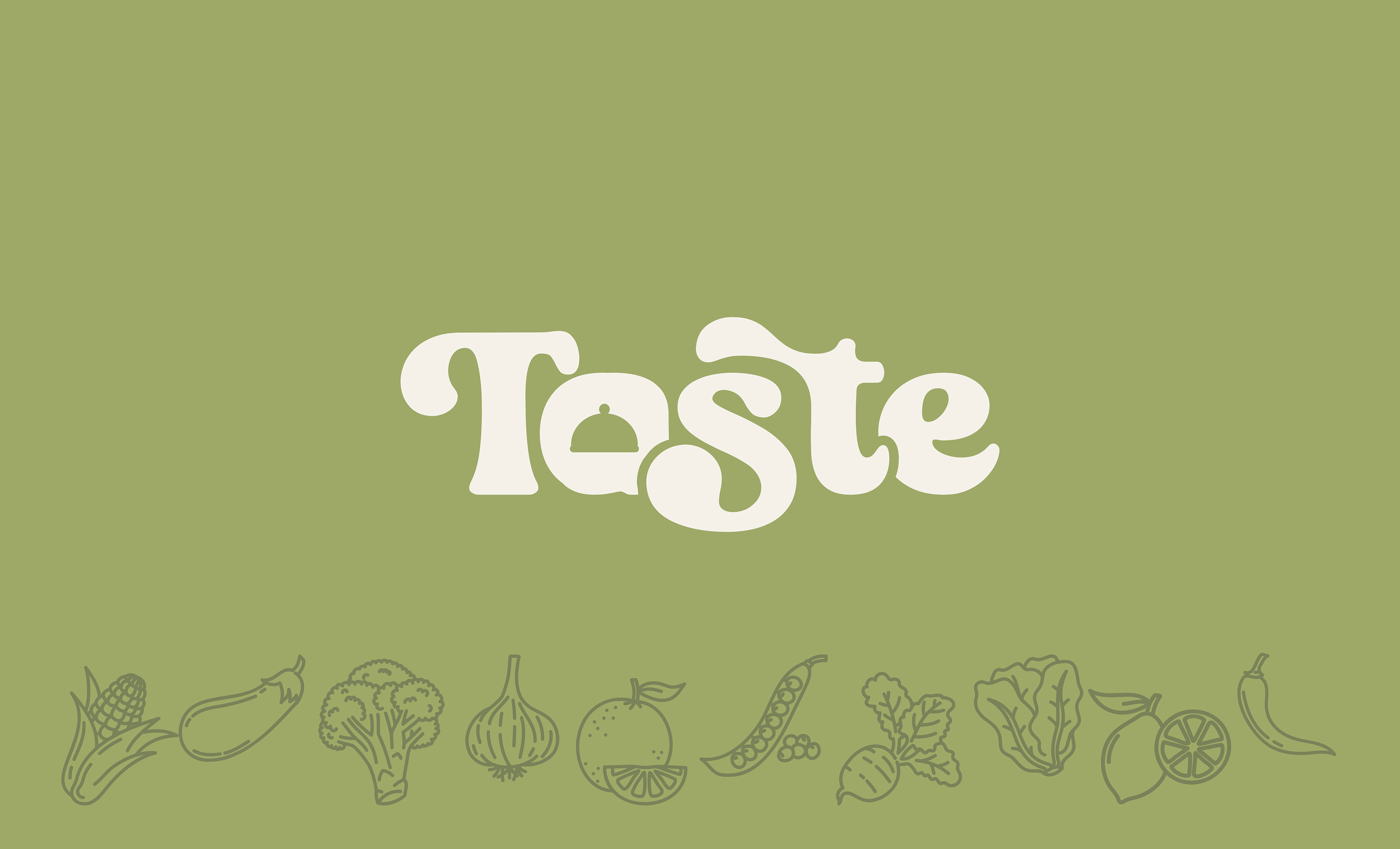
Taste is created with an organic yet whimsical visual in mind. The font used has curved edges that evoke a warm and approachable feeling.
The letter 'a' incorporates a cloche of a chef in the counter of the letter to serve as a reminder that Taste is committed to provide delicious meals that can be done with just about any ingredient you can find at home.
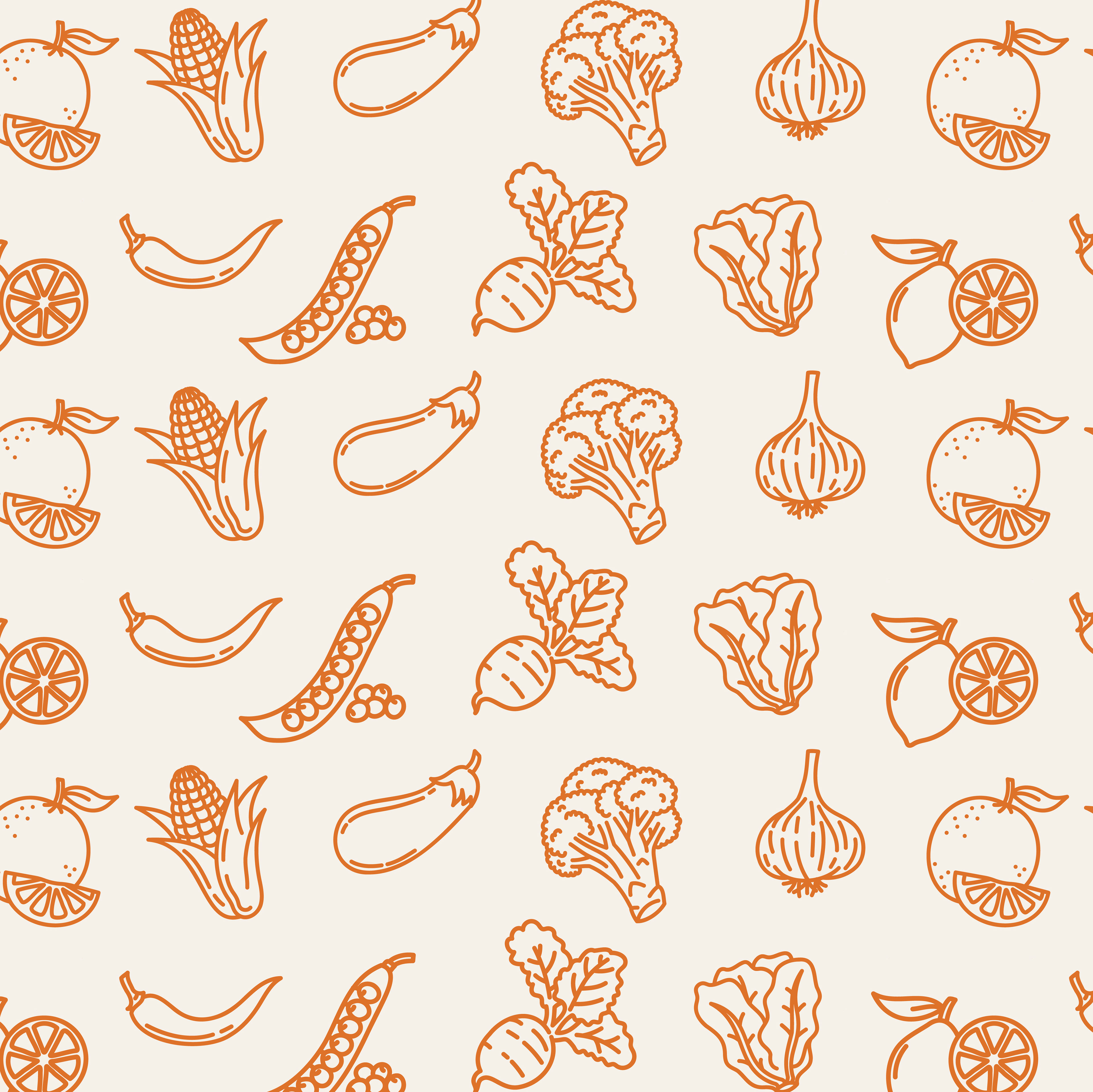
The patterns incorporated below add a playful and energetic touch to the Taste brand, while also suggesting a connection to the ingredients that are used for food preparation.
OFFICIAL LOGOS
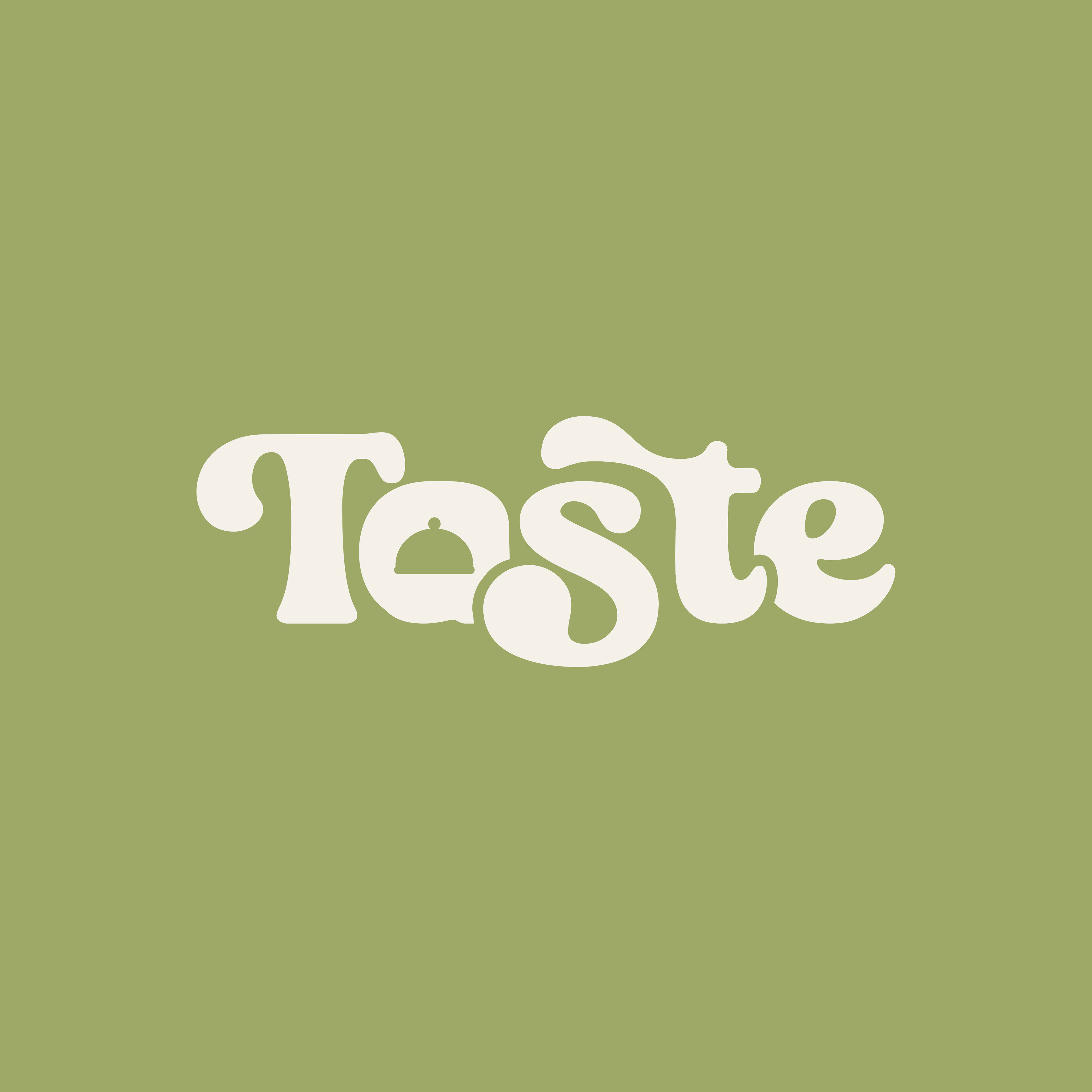


Colors
The brand's emphasis on using ingredients from the earth influenced our choice of colors for the palette.
We opted for earthy tones, particularly forest greens, to reflect this focus. In addition, we included warm shades like yellow and orange to represent vibrant fruits and vegetables that complement the cool tones.


Branding | Brand Identity | Logo Design
Kenia Lopez
Designer & Photographer
⁕
Feel free to reach out to me for design projects!
Email hello@kenialopez.com
Behance behance.net/keniadesigned
Behance behance.net/keniadesigned
Instagram @keniadesigned
Website coming soon!
-
I'm also a professional photographer
Instagram @kenialopezphoto
Website coming soon!
-
I'm also a professional photographer
Instagram @kenialopezphoto
Website https://www.kenialopez.com
-
Thanks for visiting my work!